Achieving Business Intelligence insights is often a matter of separating the signal from the noise. A well-worn technique for removing noise is to remove the outliers from a dataset, typically anythings outside two standard deviations. Personally, I always find outliers interesting and want to know what caused them. Finding outliers in Power BI is generally a visual affair and we have created the ParaTrim custom visual to help you with the task. This is an update for Version 2, we've made the visual a little easier to use and reduced the size.
Let's cut to the chase, here is a sample of insurance claims from Kaggle and trimmed using the ParaTrim Visual: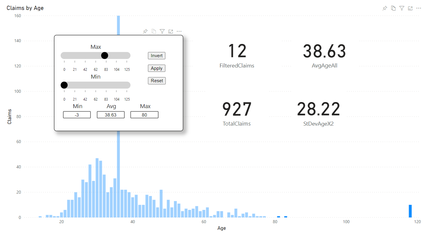
This is a typical production dataset, with some outliers, those 10 claims for a 118-year-old need to be trimmed and I've trimmed the under 21's. The graph ended up looking rather strange due to a large number of 35-year-olds losing their baggage. Key features are the Ages, which are the buckets of data and the count of the rows for that category of data.
Let's look at some synthetic data with the ParaTrim Visual, this is a thousand generated random numbers, they almost all fitted within 2SD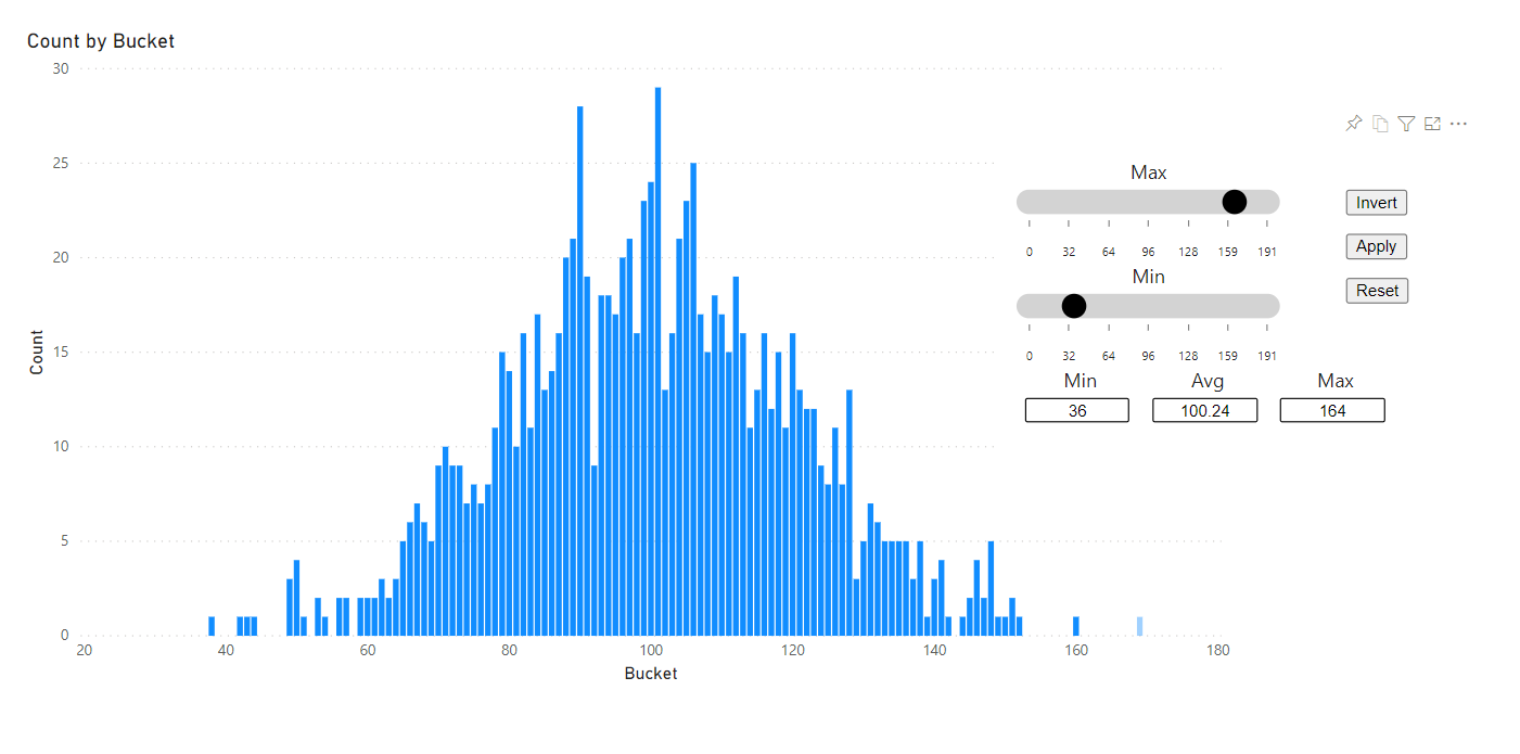
This demonstrates the 'inversion' feature where the selection is inverted is the button. Using the filter in these examples is fairly simple, the same fields as the graph are used in the filter. Also note that the filter highlights the data, not every visual understands highlighting.
Let's have a look at using the filter as a filter as well as for highlighting: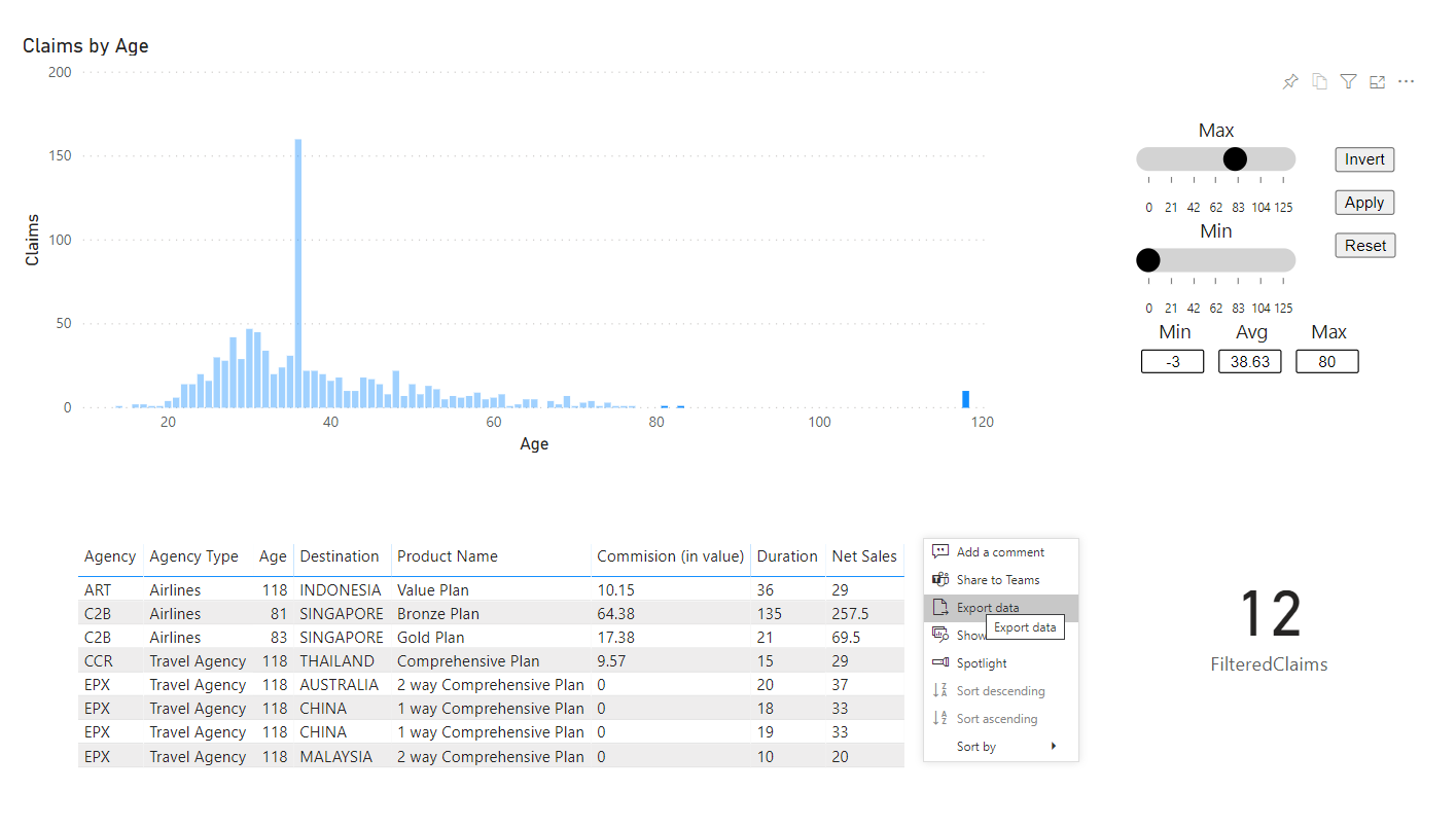
You can see from this example of filtering just the 118-year-olds, there are 10 claims and they are counted on the card and listed on the table, you can download the data using the context menu of the table visual. You can download the ParaTrim visual from the download page.